Alert
An alert is a system generated, contextual, and timely message to a user that may or may not result from their action.
Examples
base-alert--variants
Loading story...
Structure

- Container: Wraps the content.
- Icon: Supports the variant meaning.
- error icon for error and danger alerts.
- warning icon for the warning alert.
- check-circle icon for the success alert.
- information-o icon for the information alert.
- bulb icon for the tip alert.
- Title (optional): Conveys what event triggered the alert.
- Dismissal (optional): Permanently removes the alert for a user.
- Message: Text content indicating the purpose and potential next steps.
- Actions (optional): Buttons used to provide explicit action(s) the user can take to either remedy the alert or continue with a task.
Guidelines
When to use
- Advise the user that they should be aware of, or address something related to their current context.
- Reaffirm to the user that a prior action, likely in a different location or context, has been successful.
- Educate the user about new or unused feature, or information related to their current context.
- In combination with form validation to help users remedy errors. See the accessibility section for more.
When not to use
- If you need to deliver an instance level message from an admin to all users, use a broadcast message instead.
- If you are immediately confirming a user's action while they remain in the same view, use a toast instead.
- If you are promoting, soliciting feedback, or informing a user about a feature, use a banner instead.
Variants
- Danger: Advise the user that their attention is needed to address or be aware of a critical issue that relates to the current context.
- Warning: Caution the user that their attention or action may be needed within the current context, but it may not be critical.
- Success: Reaffirm to the user that a prior action they have taken, often in a different location within the application, has been successful.
- Information: Provide supplemental information to the user in regards to the current context or action they are about to take.
- Tip: Educate the user about new or unused features, and other useful information.
Behavior
- Permanently dismissible only when the alert relates to a user's individual instance and wasn't triggered by a system condition.
- Permanently dismissible when a task isn't blocked or if no action is required.
- A dismissed alert can reappear if an action or system event reproduces it.
Content
- All copy within an alert should be short, actionable, and use clear language.
- Keep translations in mind when writing copy and follow UI text guidelines.
Title
- Be brief and keep it to a single line by using a sentence fragment.
- Avoid punctuation, like periods, commas, or semicolons.
Message
- Provide next steps, troubleshooting actions, or links to learn about or remedy the event that triggered the alert.
- Avoid paraphrasing the title if one is included.
- Write as if the title was the first sentence of the message.
- Keep to one or two sentences when possible.
- Use sentence case and appropriate punctuation based on our punctuation guidelines.
Actions
- Up to two actions can be used at a time.
- Primary action uses the confirm button variant.
- Secondary action uses the default button variant.
- Left aligned, except in right-to-left languages where they are right aligned and the order is the same. See button alignment and order for more details.
Placement
- Global: Impacts the entire experience, is full-width, and is placed directly below the navigation bar.
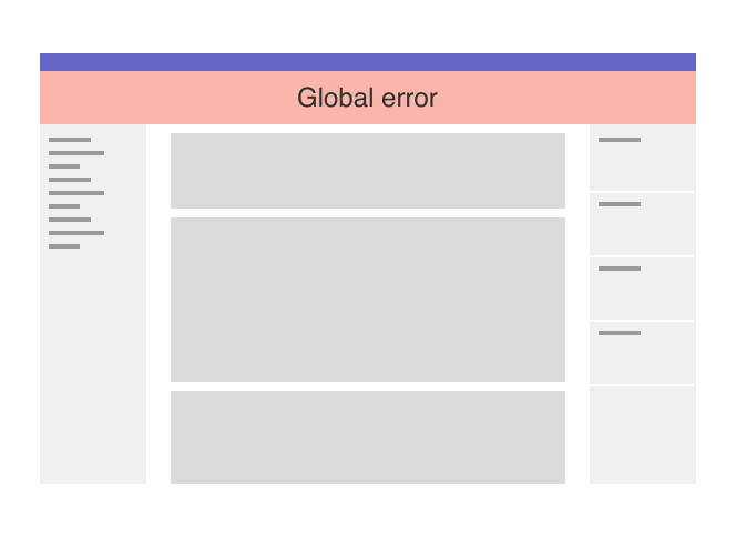
Full-width danger alert under the global navigation and above the contextual navigation - Page-level: Appears at the top of a page, directly below the navigation bar and above the breadcrumbs, and restricted to the content container width which can be either fixed or fluid, depending on user’s preference.
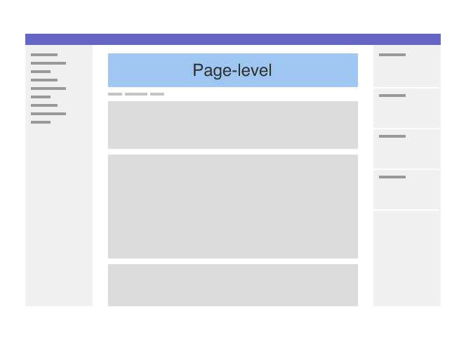
Page-level alert in the main content area with space above and below - In-page: Within a section of the page when the message is specific to that content.
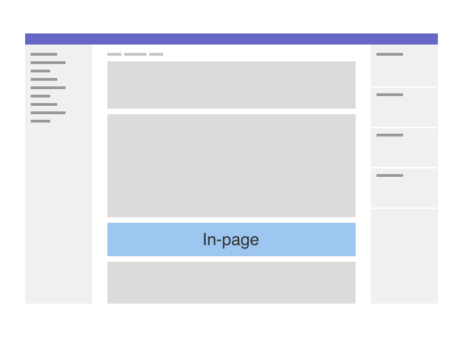
In-page alert contextually placed with space above and below
Sticky positioning
- Uses
position: stickyto keep critical information in view as the page scrolls. - Helpful when an alert is added without a page refresh and its position would otherwise be out of view.
- Typically is reserved for errors, as they need to be addressed by users.
- Only one sticky alert should be used at a time.
Multiple alerts
- Multiple alerts should be avoided if at all possible, but if necessary ensure the placement of each is in the same context as the content it relates to.
- When multiple alerts are present in the same location, order them from most to least severe.
Accessibility
- An alert should receive focus and use
aria-liveto announce its presence and allow a user to interact with it immediately. - If sticky positioning is used, the user must still be able to access and view focusable elements the alert may be covering.
- An alert is separate from, but complimentary to validation error messages. In this way an alert announces that there are validation errors and links a user to each instance.
Related
Last updated at: