Keyboard-only
Principle: All interactive elements can be accessed by keyboard alone.
Using a keyboard is a fundamental aspect of accessibility. In fact, many other technologies and hardware emulate keyboard functionality. Users with a wide range of disabilities — or no disability at all — rely on a keyboard. When testing, keep in mind that all interactive elements should be accessible with the keyboard.
Sections
Keyboarding basics
- Use the Tab key to navigate in a linear direction through focusable elements like links, form controls, and buttons.
- The Enter key (and sometimes Space) selects an element.
- Arrow keys are used to move within certain elements, element groups, and widgets. For example, within form
selectelements, radio button groups, and a set of tabs. - For a more comprehensive list of actions, review this table of common keyboard interactions.
If you're testing in Safari or Firefox in macOS, you'll likely have to update a few settings so that all focusable elements can receive focus; details below. The resources section contains additional links with more details on enabling keyboard navigation for focusable elements.
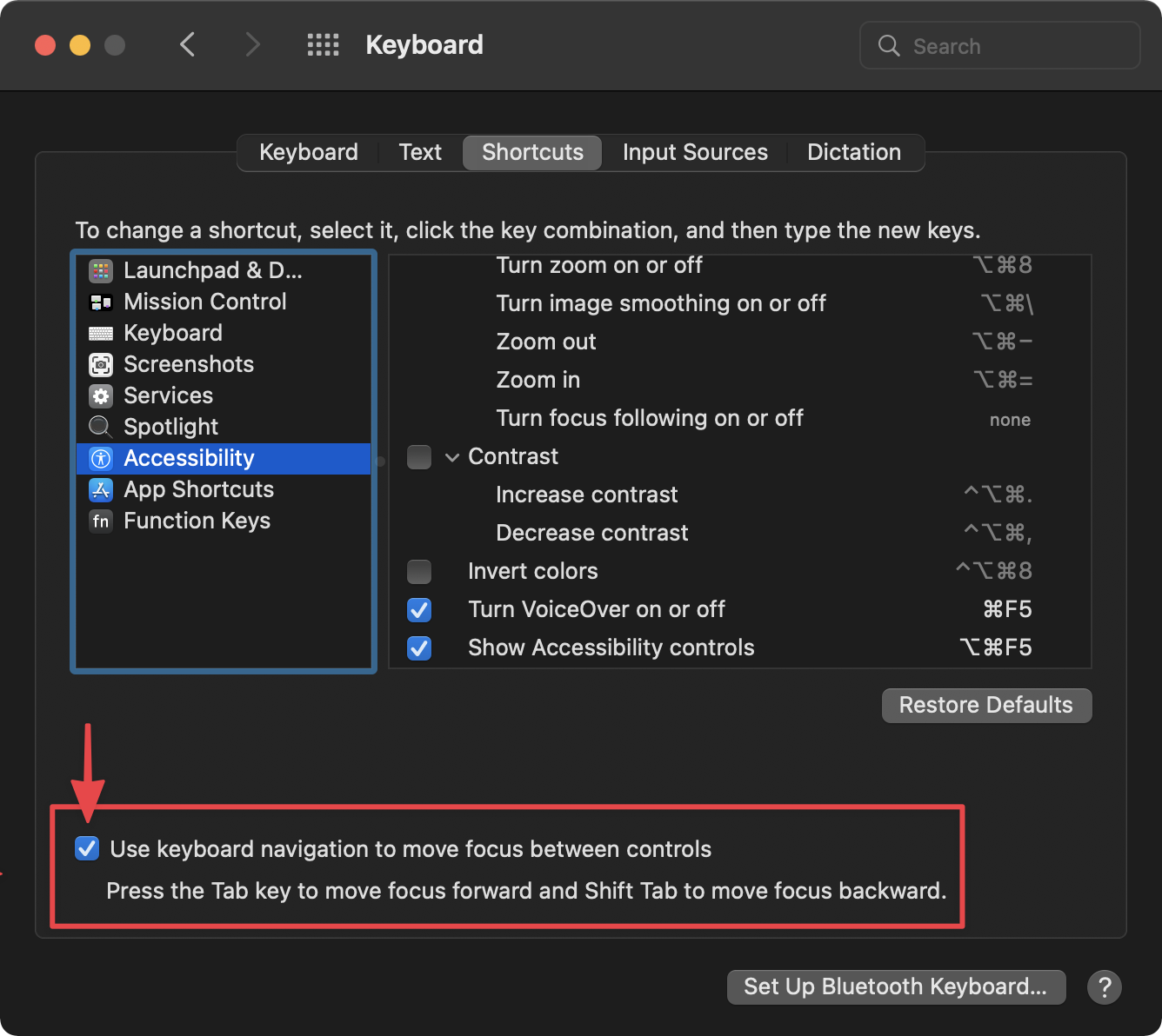
For Firefox:
- Go to System Preferences > Keyboard > Shortcuts.
- Check the "Use keyboard navigation to move focus between controls" option.
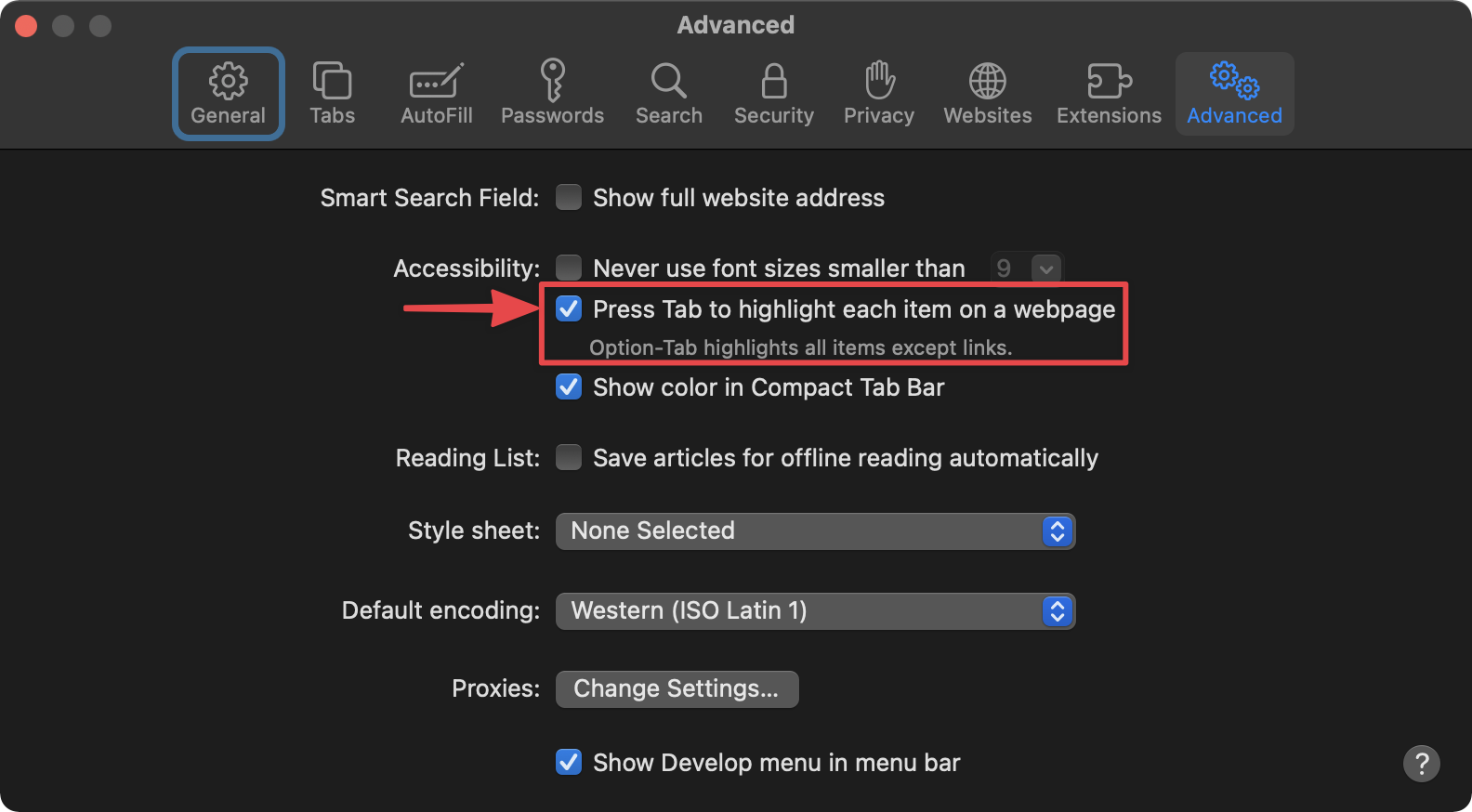
For Safari:
- Open Preferences > Advanced.
- Check the "Press Tab to highlight each item on a webpage" option.
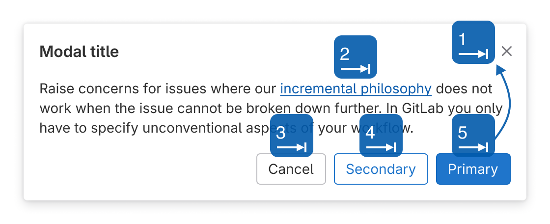
Focus order
The focus order is the sequence that a keyboard user tabs through focusable elements. In most cases the focus order and DOM order should be the same. Visually reordering elements with CSS, such as with floats, flexbox, or grid, can be problematic for focus order, so ensure content makes sense both visually and linearly in the markup. To learn more about what elements should be focusable by default read this Introduction to Focus.
Some HTML elements, like form elements and buttons, receive focus by default because they have native event handling. In these cases nothing has to be done for them to be in the focus order. That being said, it’s possible to use the tabindex attribute to make elements focusable.
tabindex="-1": This makes an element programmatically focusable, but doesn’t include it in the tab order.tabindex="0": This inserts and element into the focus order in the order of the DOM.tabindex="1"+: This adds a higher focus priority and isn’t recommended due to a negative cascading effect
Expected behavior
- Only interactive elements are focusable, not static content.
- Focus order follows the DOM order and reading order.
- When a navigational menu is in an expanded state that reveals more links, the focus should move through those links before moving on.
- For widgets such as assignee dropdowns:
- Its popup element appears either on focus, or when pressing Enter, Space, or ↓.
- The arrow keys move focus within the widget.
- Enter accepts the selected value and optionally closes the popup. Focus remains on the widget.
- Esc closes the popup and focus remains on the widget.
- Tab leaves the widget and focus moves to the next interactive element or widget. Tab should not move focus within a widget since widgets are treated as a single interactive element.
- The focus order of a page should complete a loop and return back to the browser’s address bar.
Identifying problems
- The focus order bounces around the page or doesn’t follow the expected reading flow.
- Inspect the DOM order to determine what the linear content flow is.
- If there are no issues with the DOM order, inspect the CSS to see if floats, flexbox, or grid are visually reordering elements.
- If the DOM order and CSS don’t seem to be impacting the flow, check to see if any elements have
tabindexset to a value of1or higher.
- An element receives focus, but shouldn’t.
- Check to see if the element has the
tabindexattribute and it’s set to0or higher.
- Check to see if the element has the
- An element doesn’t receive focus, but should.
- It’s possible that focus is received, but a visible focus state is missing, see the section on Focus States for more.
- If the element is custom, or not one that natively receives focus it should have
tabindexset to0.
- Focus gets trapped somewhere in the page and can’t complete a loop back to the browser’s address bar.
- See the section on Keyboard Traps.
- Focus seems to disappear when tabbing.
- Elements that are visually hidden, like a mobile menu in a desktop view, can still receive focus if they don’t use a method which also removes them from the focus order. Use an extension, like NerdeFocus for Chrome, to reveal where focus is being placed.
- In CSS,
display: none;orvisibility: hidden;are good ways to remove focus. The element could also have thetabindex="-1"or hidden attributes added.
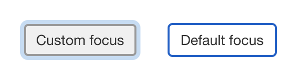
Focus states
Every focusable element must have a visible focus state for keyboard navigation. Typically a focused element has a stronger border, glow, or shadow to highlight it. Browsers provide a focus ring by default, but this can be removed or enhanced with CSS.
Expected behavior
When an element receives focus with the keyboard, it’s visually distinct from both its other states and other elements.
Identifying problems
An element has focus, but there’s no visual indication.
- Inspect the CSS to see if
outlineis set tononewithout adding styles to the:focusstate. - A utility like What Input? can detect the input method (mouse, keyboard, or touch) and provide ways to change focus styles based on the input method. Make sure you’re using a keyboard for the input method and that no utilities are interfering with the styles.
Keyboard traps
A keyboard trap keeps the focus order looping within a section. A modal, for example, uses a keyboard trap to prevent a user from focusing on content elsewhere in the page — content that could even be hidden by the modal itself. There should never be a keyboard trap that a user can’t get out of.
Expected behavior
- After encountering a keyboard trap a user should be able to “untrap” the focus with the Esc key, a close button, or other action that navigates the user away from the current experience.
- When the user exits the keyboard trap (without page reload or navigating away) the focus should return to the previously focused element, usually the one that triggered the keyboard trap in the first place.
Identifying problems
- An element like a modal or dialog that overlays other content is activated, but the focus can leave that element, and even focus on items covered by it.
- A keyboard trap should be created and controls should exist to close the element and return focus to its previous location.
- An item that should be a keyboard trap never receives focus.
- Custom elements should have
tabindex="-1"set and focus should be programmatically placed in them from the triggering element.
- Custom elements should have
Skip links
Skip links are anchor links placed before a section that allow a user to bypass blocks of repeating page sections (typically navigation), and "skip" to the main content. They’re typically not visible until they receive focus, and then they’re visible for all users.
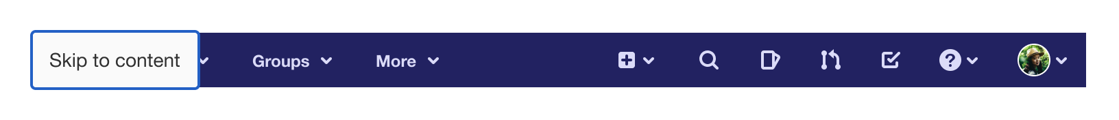
Expected behavior
- A skip link is typically the first focusable item on the page and should take a user to the main content area.
- Skip links should be minimally used, if multiple are present there may be other navigation or content issues.
Resources
- NerdeFocus - Chrome extension to reveal where focus is placed with an option to record the focus order.
- ChomeLens - Chrome extension for accessibility testing that includes a “Trace tab path” feature that traces the focus order with an option to download an image of the results.
- “Skip Navigation” Links - A comprehensive article about skip links.
- Controlling focus with tabindex — A11ycasts #04 - Learn how to add keyboard support for custom elements.
- Roving tabindex — A11ycasts #06 - Learn how to add deep keyboard support for custom controls.
- No, tabbing is not broken. Yes, I was confused too. - Learn how to enable full keyboard navigation for focusable elements in macOS Safari and Firefox.
- Browser keyboard navigation in macOS - Learn how to enable full keyboard navigation for focusable elements in macOS Safari and Firefox.
Last updated at: