Feature discovery
New features can enhance the experience and unlock significant value for users. However, a user’s context plays a significant role in how they engage with new functionality. According to the FOGG Behavior Model, three factors impact people's behavior with regards to completion of tasks:
- Their ability to perform the task.
- Their motivation for the task.
- The prompt that triggers the behavior.
Prompts to trigger the desired behavior succeed when motivation and ability are high enough. We can improve a user's ability to perform a task by guiding them using discovery patterns and boost their motivation by clearly communicating the value of a task. Keeping these principles in mind helps us to improve both the experience and make it more likely that a user achieves their desired outcome.
Before introducing new feature discovery patterns consider the following:
- Why does this feature need to be promoted? Is it a value driver that leads to an increase in conversion?
- Is it possible to design the feature so that it doesn't need to be actively promoted?
- Does the discovery pattern need to be shown to all users or only a subset? Who is the target user persona or user role?
- If a feature is already being promoted on the page, will the new notice compete with it? Should it replace it instead?
- If two features need a discovery pattern, can they be bundled into one? This may be possible, for example, if they are part of the same Job to be Done.
Use input data to determine where, when, and why a feature discovery pattern is needed. After introducing a new discovery pattern, measure its effect on both conversion and adoption before making it a permanent part of the product.
Patterns for feature discovery
Contextual notices
Contextual notices are unobtrusive messages that appear when a user interacts with specific UI elements. They relate directly to an action that a user or namespace has performed. Once dismissed, the notice does not reappear unless the user attempts to re-engage with that feature.
Contextual links
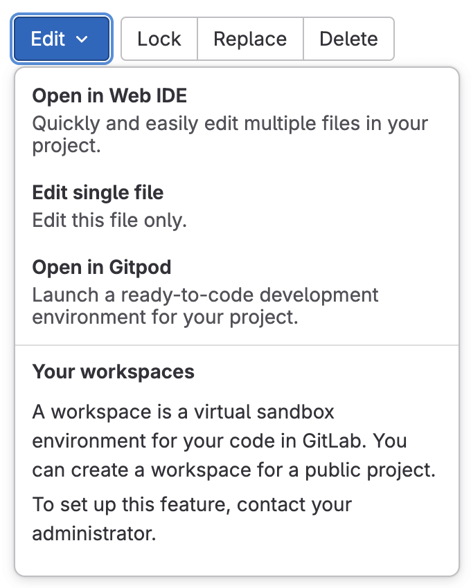
Alongside relevant features, in-page links allow a user to directly access or enable a feature without navigating through multiple layers of menus.
Visual cues
Design elements, like icons and badges, can visually guide a user toward a new feature. For example, a "New" badge or icon on a feature can attract attention.

Banners
A banner can promote awareness of a new feature, but should be used sparingly. A banner that doesn't match the user's current context can feel irrelevant and contribute to banner blindness or fatigue. A user might start ignoring all banners without fully reading the content.
Onboarding
A well-designed onboarding process can be an effective way to introduce a user to a new feature, like CI/CD setup, or product stages, such as adopt the Secure DevOps stage. However, it's primary goal is to showcase the value a user gains from these features and stages.
Guidelines for onboarding experiences
- Identify the value that you're trying to give to the user and work backwards from that. Having a new feature that you want to showcase alone isn't a good reason for onboarding. What is the user-facing value of the new feature? How will they benefit from it?
- Provide a "No, thanks" option that allows users to opt out.
Think about the user's context
The next step should be to think about the user's context. Where in the app are they? What are they doing? How familiar are they with what you want to show them? Do they have the ability to perform the task? Is their motivation high enough? If not, how will you improve their ability or increase their motivation? Where will you place the prompt so that it’s contextual?
Patterns for initial prompts
The following patterns can be used as initial prompts to start the onboarding flows. Consult the intrusion level, pattern effectiveness, and recommendations for each one when deciding which to use.
| Pattern name | Intrusion | Effectiveness | Notes and recommendations |
|---|---|---|---|
| Popover | High | High | No major changes to the UI required. Use at the beginning or end, not in the middle, of a complex flow or task. Use to guide a user through different pages. |
| UI modification | Medium | Medium | Not a reusable component. Can be used in combination with others but generally requires significant changes to UI. For example, an empty pipeline widget when no pipeline is present on the Merge Request page. |
| Banner | Low | Low | Might require significant changes to the UI. For example, displacement of default elements. |
| Empty state | Low | High | Empty states can be used as great starting points for onboarding flows. They’re not intrusive as there’s no content to show; they can give context, explain the value, and provide a CTA. |
Recommendations for writing copy and providing context
Consider the following recommendations to make your initial prompts more effective and contextual.
- Always explain why the initial prompt is shown (for example, you don’t have a pipeline to check the quality of your code, we can show you how to set it up quickly.)
- What is the value that the user will get from it (for example, it will make your code more secure and robust.)
- Avoid generic CTA copy like “Let’s go” or “Show me how”. Use something that will tell the user what value they’ll get out of it so that even if they only scan through the copy of the prompt, they’ll still have a good idea of what it is they’re doing and what the result will be. Good example: ”Secure your code”.
Follow-up prompts
Sometimes, the onboarding flow will span across different pages. When that’s the case, use the popover component to keep a user on the right path. The popovers can be animated in with a short delay after the page has loaded to make sure that they’re noticed.
How many steps?
When an onboarding flow expands across several steps (and possibly pages), try to aim for three steps. Five should be the maximum. If you think you need more, consider breaking it down into multiple and smaller flows. The more steps an onboarding flow has, the less likely it is that a user will complete it.
Related
Last updated at: