Filtering
Search vs filter
Search helps a user find records matching a particular value. We use the search component in the UI for this purpose.
Filters narrow down a list of records to ones that contain a common value. For filtering data, we use either the filter component on its own, or a combination of other components, for example tabs, search, or sorting. We refer to the ways we combine components together as filtering patterns in the product.
The main factor for choosing between search and filter should be the user’s goal:
- If the user is looking for a specific item, the search component should be used. For example, trying to find a particular group member by name, surname, or username.
- If the user is looking to narrow down a list of items based on specific parameters (single or multiple values), the filter component or filtering patterns should be used. For example, narrowing down a list of issues for a particular team member and milestone.
Data complexity and filtering patterns
The filter component is flexible but complex and should primarily be used for filtering data by numerous parameters (for example, a list of issues or merge requests). Consider using other filtering patterns for data that is less complex (for example, a list of users).
The filter component, alongside tabs, dropdowns, sorting, date picker, and search can all be used for filtering data. The more complex the data, the more components required to filter it.
For example, in a list of members where name, username, and join date are the data, the sorting and search components are likely sufficient to narrow down the list. If the data also includes the status for each member (active or inactive), adding tabs to allow users to navigate between the member statuses would be an additional, useful level of filtering. Further, if user role is also part of the data, a dropdown could be used to filter by this parameter, as well.
Consult the table below for general guidance on common filtering patterns in the product, and examples of which-components-to-use-when, based on data complexity:
| Data complexity from 1 (low) to 5 (high) | Data examples | Components |
|---|---|---|
| 1 | Member name, username | Search |
| 2 | Member name, username, join date | Search, sorting |
| 3 | Member name, username, join date, status | Tabs, search, sorting |
| 4 | Member name, username, join date, status, role | Tabs, search, dropdowns, sorting |
| 4 | List of projects or groups | Tabs, search, dropdowns, sorting |
| 5 | Lists of issues or merge requests | Tabs, filter, sorting |
Placement guidelines
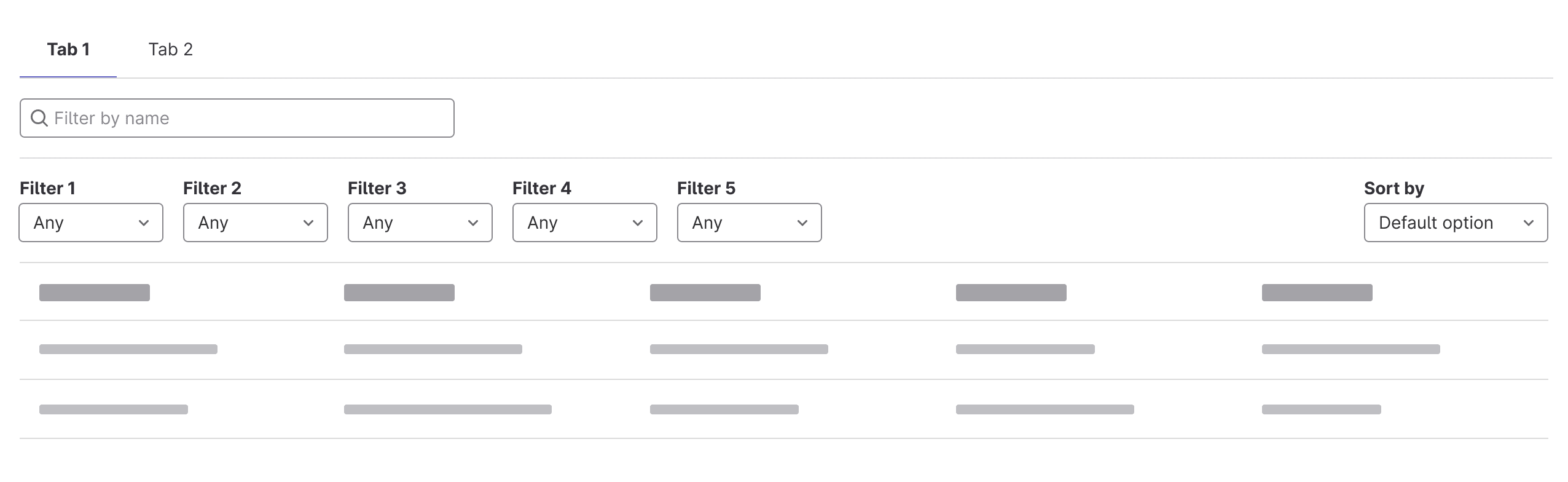
In situations where the filter component isn’t used (levels 1-4), search is placed on the left, followed by dropdowns for filters. The dropdown for sorting should be inline but right-aligned. The recommended number of filter dropdowns is 3-5. When more are required, consider using the filter component or the filter builder.
Adding single filters within a dropdown
This pattern is recommended for cases when a single filter can be selected in each dropdown. For example, when a list of issues can only be filtered by one assignee.
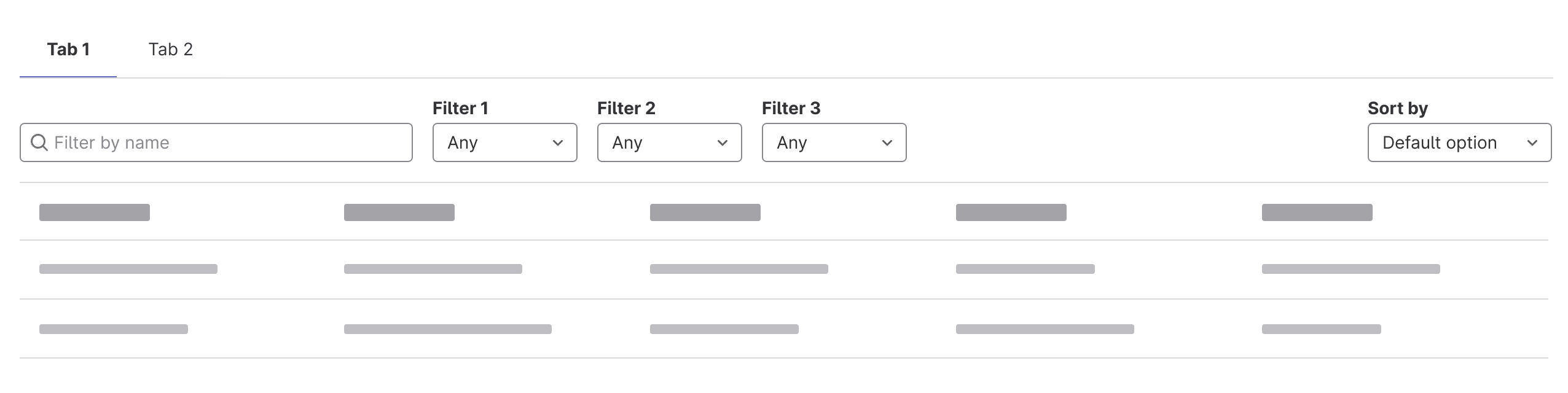
When the filters do not fit on the same line as search, all dropdowns are placed below and separated by a horizontal rule. The sorting dropdown is inline but to the right of the filter dropdowns, the search remains limited in width.
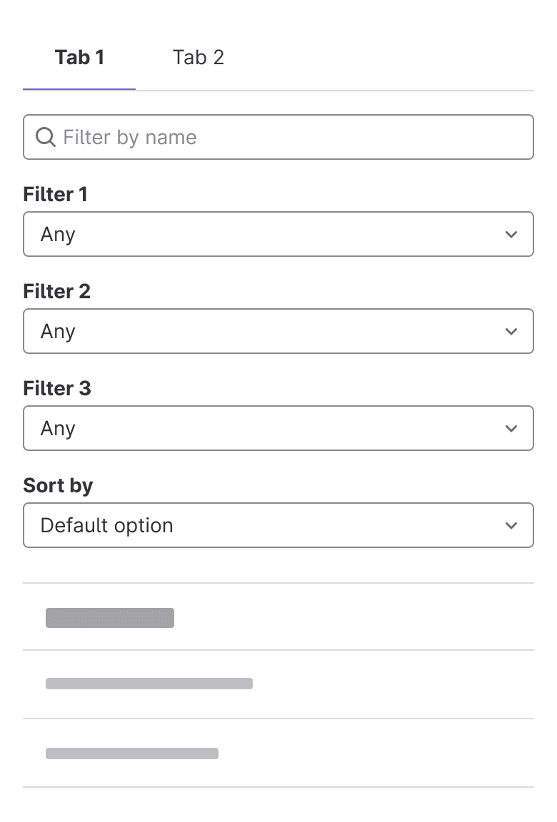
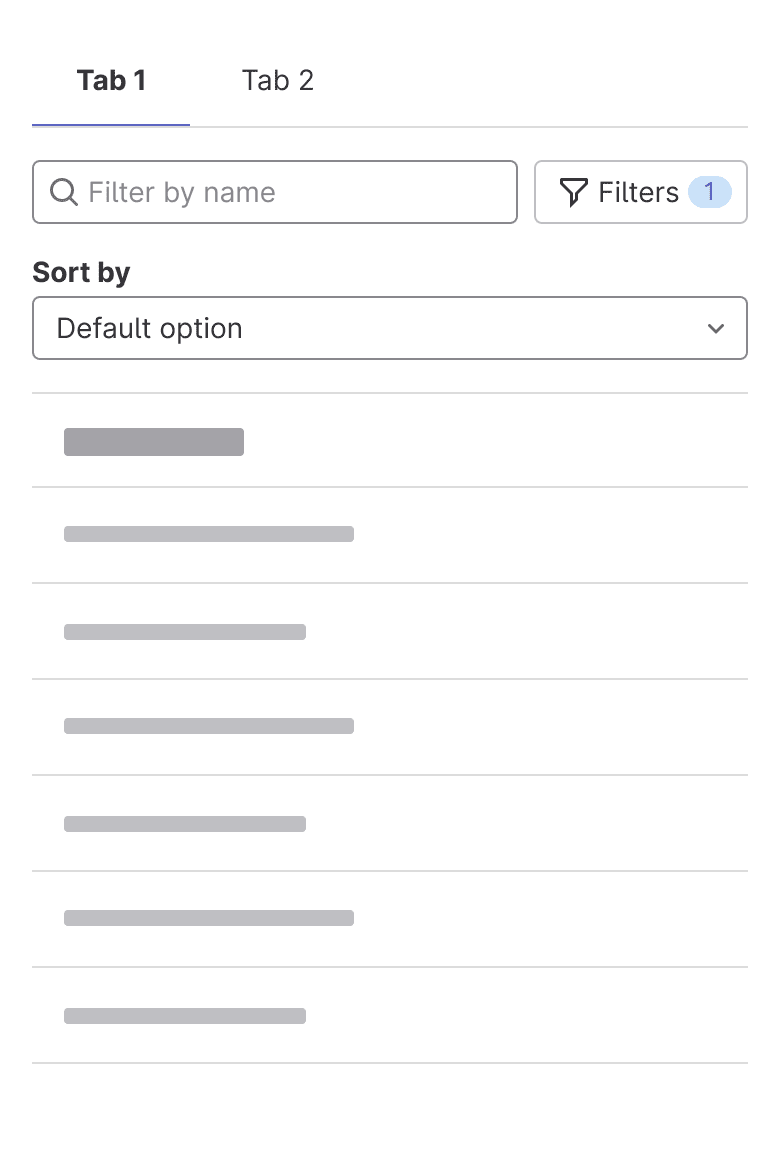
On small screens the filter and sort dropdowns get pushed below the search and are full width. The functionality of toggling the visibility of filters can be added to make the UI less overwhelming. Trigger the visibility of the filters using an icon button with a filter icon and the label Filters. If filters are applied and then hidden, the button reflects the number of filters applied in a badge to the right of the button label.
Adding multiple filters within a dropdown
This pattern is recommended for cases when multiple filters can be added within each dropdown. For example, when a list of issues can be filtered by multiple assignees.
Filter builder
Related
Last updated at: