Button
A button indicates a distinct action and executes a function. Text, icon, or a combination of the two express the action and are supported by the variant and occasionally a tooltip.
Examples
Structure

- Icon: Icon indicating or supporting the action.
- Label: Text clarifying the action.
- Dropdown: chevron-down icon indicating a dropdown menu.
- Emoji: Pictogram character.
- Badge (optional): Counts the number of items or provides a status related to the action.
Guidelines
When to use
- A button (
<button>) element is used to indicate an action.
When not to use
- If you are directing a user to a new location, consider using an anchor (
<a>) element, which can also be styled like a button when actions and destinations are present in the same set of controls.
Categories
Use categories to bring varying action hierarchy and emphasis that guide the user when performing tasks.
Choose a category based on the overall hierarchy on a given page, as well as the individual contexts found within. Defining context depends on the hierarchy of information displayed on the screen, the motivated user flow, and the available tasks. For example, a settings page may have multiple equally important contexts, each requiring its own primary button to complete a task.
Note that contexts may be temporary, such as a modal.
Too many secondary actions in a single view can flip the intended hierarchy. For example, a list of items where each has a secondary danger button can be overwhelming and distracting, especially when that action is repetitive and understood. In cases like these it may be better to use the tertiary category or the default variant in order to preserve the intended hierarchy.
- Primary: Provide the strongest visual emphasis to an action with a solid background — one per context.
- Secondary: Indicate a supplemental action with a border that matches the variant and a background that is close to, or the same as the page background color — one or more per context.
- Tertiary: Incorporate a borderless action into the flow that has a background during interaction for affordance — one or more per context.
Variants
Use the visual style (variant) in combination with an icon or label to identify the type of action performed and its importance compared to other actions in the same context.
- Default: Use for an action that doesn’t warrant prominence, typically when a primary variant is already used in the same context.
- Confirm: Indicate a positive or negative non-destructive action that is confirmation of what the user desires to take place.
- Danger: Highlight an action that is destructive and undoable or has potentially detrimental consequences. In a long list of items where each contains a destructive action, use the
defaultvariant to avoid having many danger buttons overwhelm the page. Any final confirmation that is destructive must use thedangervariant (unless a browser dialog is used). - Dashed: Highlight an action to indicate an object has yet to be created.
- Link: Visually style an action like an anchor link when using a link isn't possible.
Sizes
- Medium (default): The medium button size is sufficient in most cases and provides the largest possible click target size.
- Small: Decrease the size of a button to prevent it from competing with a primary button, or to decrease the overall size of a group or string of buttons. Although it's possible to use the small size for an icon-only button, using the default medium size is encouraged to provide a larger click target.
- Block: Expand the width of a button to fill the parent container which can help provide balance in mobile layouts.
States
States change visually and/or programmatically depending on user interaction or a predetermined state. For example, programmatically moving focus to a button in a modal when it opens. This ensures they're accessible and feel reactive for different modalities.
- Disabled: Prevents the user from performing an action. It lets the user know a certain action would be possible if circumstances were different. All buttons regardless of variant appear the same when disabled. Additionally, they will show the "not-allowed" cursor when hovered.
- Loading: Place a button in the loading state with the
loadingproperty. The loading status is indicated by the use of a spinner, and the button is disabled while the state persists.- For buttons containing text, the spinner is added to the left of the button, before the icon or label.
- For icon buttons, the spinner replaces the icon.
- Selected: Acts like a toggle that indicate whether or not an option is in a selected state. To indicate to screen readers that the button functions as a toggle it should have
aria-pressed="true"to align with the visually selected state, otherwisearia-pressed="false".
Content
Labels
- Use concise language that conveys what happens when the button is activated.
- Use sentence case.
- Append an ellipsis (…) to the button label text when the action will require additional input from the user before final completion. Does not apply to danger actions.
- Try not to use text-only and icon-only buttons in the same context.
- For destructive actions, use clear text and always indicate what is being destroyed. For example, use Delete page instead of just Delete.
- For buttons that copy content to the clipboard, don't use to clipboard. For example, use Copy branch name instead of Copy branch name to clipboard.
Icons
- Only use icons from GitLab's SVG library.
- Icons use the default size (16×16px).
Badges
- A single badge can be used to the right of a text label to indicate status or a numeric count.
- A badge that includes a numeric count should be followed by a
<span>with thesr-onlyclass providing a text description of what's being counted. - The badge variant should match the button variant. For example, a danger badge within a danger button.
- The badge size should match the button size. For example, a small badge within a small button.
Alignment
Buttons can be aligned left, right, or center depending on the context. Multiple alignments can be combined within a single screen, but not within an individual context. For example, on a single screen the main content uses left alignment, while the sidebar with multiple settings uses right alignment.
- Left alignment: In page content and forms where the content is typically unconstrained other than by the grid layout. In these instances an F-pattern (top to bottom and left to right in a horizontal movement) is common for reading flow, and buttons align with other content on the page like headings, lists, input labels, and form labels. Left alignment is a benefit for accessibility in many ways, including reading flow, focus order, and page zoom where right-aligned buttons may be initially off screen.
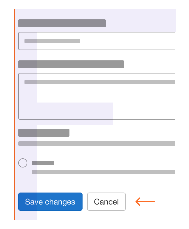
Left-aligned buttons in a form 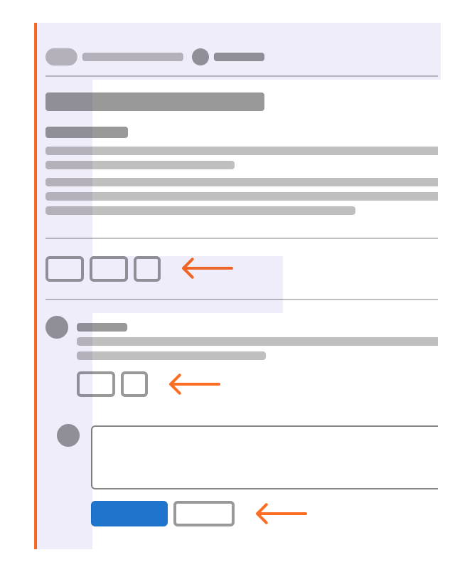
Left-aligned buttons in a page flow - Right alignment: In constrained containers like modals and dialogs, flows that continue in a progressive direction, actions with a global impact, and toolbars. In these instances a Z-pattern (top to bottom and left to right with a diagonal, scanning movement) is common for reading flow. In these instances a user may be taking a progressive action, like affirming a modal, or an action upon a section, like formatting text in a comment.
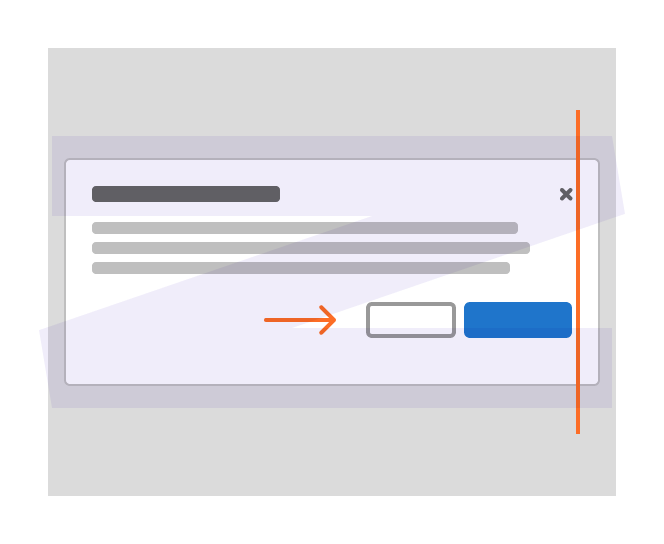
Right-aligned buttons in a modal 
Right-aligned buttons in a sidebar with multiple settings 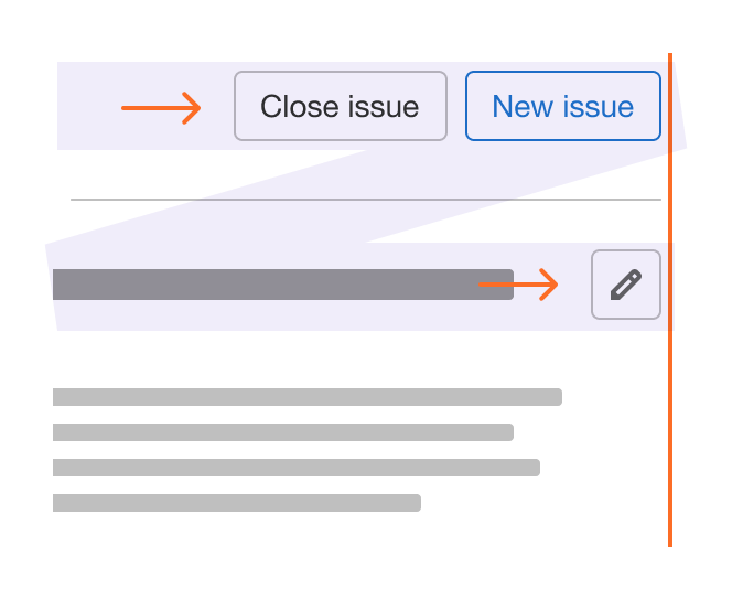
Right-aligned buttons as global actions 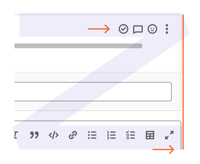
Right-aligned buttons in toolbars - Center alignment: Only used for empty states where content is promotional or the actions are the only ones available in context.
Center-aligned buttons in an empty state - Right to left languages: Reverse button alignment for right-to-left languages while maintaining the same order.
- Additional considerations:

Do: Keep buttons visually grouped 
Don't: Separate buttons or mix alignment (unless the separated button is destructive) 
Do: Keep destructive buttons separate 
Don't: Group destructive buttons with confirmation buttons 
Do: Keep buttons inline when space allows 
Don't: Stack buttons vertically if there is space to place them inline
Order
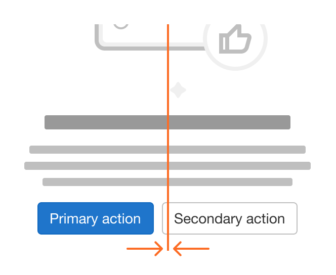
- Affirmative actions are positioned to the outer edge of a container. This means that on left-aligned buttons the affirmative action is the left-most action, and on right-aligned buttons, the affirmative action is the right-most action.
- An affirmative action is something that takes the users further in their journey (for example, Save or Delete), while a dismissive action takes a user back (for example, Cancel). Depending on the context, an affirmative action may be destructive.
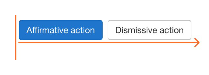
Affirmative action on left edge for left alignment 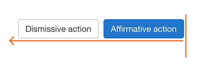
Affirmative action on right edge for right alignment - The visual hierarchy is primary buttons on the outer edge, followed by secondary buttons, and so on.
- One exception to the visual hierarchy is an ellipsis button. When using an ellipsis button, place it on the outer edge.
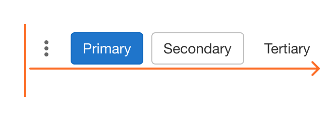
Hierarchy from left to right for left alignment 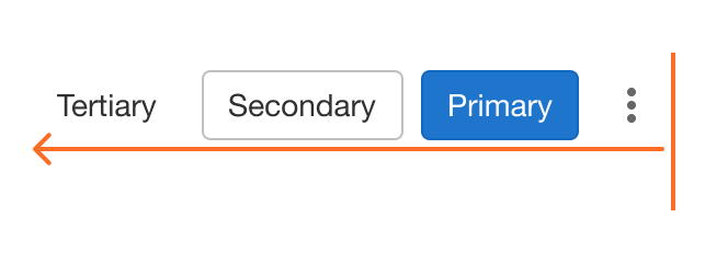
Hierarchy from right to left for right alignment
Combinations
Buttons can contain different content depending on the situation. For example, some buttons only have text, while others only have an icon. A combination may be used when space allows and more emphasis is required. Icons are always positioned to the left of text. Two icons should never be used in the same button, unless it is an icon dropdown.
- Label: A button may also be attached to a label, such as a commit SHA.
- Emoji: An emoji button provides a user with a visual to indicate what emotion has been attributed to the parent object. It only contains an emoji character and uses the selected state when pressed.
Dropdown buttons
A dropdown button triggers an option menu.
- Text and icon dropdowns: A dropdown button uses the chevron-down icon to the right of the text label. The chevron is the only icon that should be present with a text label.
- Split dropdown: A dropdown button is split when additional related actions are available. The left half displays the default action and the additional related actions are contained within the attached dropdown on the right half. The options available in the dropdown perform the action on click.
Icon-only buttons
- An icon can be used in place of text.
- Use a tooltip to provide context, unless the action may be universally understood, like a closing action using the close icon.
- An icon-only button shouldn't be used to toggle between two states. If the icon and action of the button change after clicking it, it can be difficult to determine if the icon represents the current or future state. For example, a button that uses the eye icon and changes to eye-slash when clicked doesn't make it clear on its own whether or not it represents that an object is confidential or will be as a result of clicking. Use a toggle or checkbox with a label to more clearly indicate alternating states. Note that this scenario is different than an icon-only button with a selected state, as there the icon doesn't change.
Ellipsis
An ellipsis button is a specific kind of icon-only button that allows for expanding content inline. It can be used when content is hidden for the purpose of not overloading the user or because of initial space constraints.
Group
Button groups visually group buttons that have similar or related actions together to emphasize the relationship and aid with arrangement and spacing. When button groups are used to select an option from a series of options, a single button in a button group can act as an indicator of the currently selected state.
Pagination and segmented controls are specific types of button groups.
Accessibility
- Maintain parity between focus order and visual order (don't use CSS to reorder buttons).
- A visible focus state must always be present, regardless of the mode of operation (mouse, keyboard, other). We currently rely on
:focusfor this state. In the future, we may explore the use of:focus-visible, but more research needs to happen first, specifically around browser heuristics. Many kinds of users benefit from visible focus indicators (like a focus ring), not just keyboard users. From Understanding SC 2.4.7 (for Focus Visible (Level AA)): "People with attention limitations, short term memory limitations, or limitations in executive processes benefit by being able to discover where the focus is located." Matsuko's Understanding Visible Focus Indicators lists additional examples of users that benefit from visible focus indicators:- Users using alternative input devices, such as keyboards and switches.
- Users with low vision.
- Users with cognitive disabilities, especially those that affect memory or attention such as dementia and ADHD (Attention-Deficit/Hyperactivity Disorder).
- Icon-only buttons must use
aria-labelto indicate the action. - When an icon is used with a text label, the icon should be hidden from screen readers with
aria-hidden="true".
Reference
These variants have been deprecated, don‘t use in production:
- Info: Activation or informative processes, replaced by confirm variant.
- Success: Positive actions such as the creation or addition of items, replaced by confirm variant.
- Warning: Actions that can be undone or rectified but warrant caution, replaced by confirm or default variant depending on context.
Last updated at: