Banner
A banner promotes awareness of a new feature or high-priority research initiative.
Examples
base-banner--introduction
Loading story...
base-banner--default
Loading story...
Promotion
Loading story...
Structure

- Container: Wraps the content.
- Illustration (optional): Compliments the content.
- Title: Header for the content.
- Message: Text content indicating the purpose and potential next steps.
- Dismissal: Removes the banner for a user.
- Action: A single button to provide an explicit action the user can take based on the message.
Guidelines
When to use
A banner should be used sparingly and with consideration of its impact to neighboring components and the overall user experience to:
- Inform a user of a feature that isn't enabled.
- Promote a new feature.
- Solicit user feedback.
When not to use
- If you need to communicate that a feature hasn't been configured or used, consider using an empty state instead.
- If you're giving tips and hints for an existing or established feature, consider the tip alert variant instead.
- If you need to communicate system status, consider using an alert instead.
- If a user can't take immediate action, activate a feature, or benefit from the content, then the banner shouldn't be displayed.
Variants
- Introduction: Provide a basic introduction to help users get started with an existing feature. Illustration optional.
- Promotion: A promotional message to encourage exploring or upgrading to a new feature. Illustration optional.
Behavior
- A banner can always be dismissed.
- It doesn't reappear by default, but in rare circumstances the banner can reappear after 7 days have passed.
- The action should direct a user to one of the following:
- Docs for an installation guide.
- Where they can upgrade their plan to enable a feature.
- A format for contributing or providing feedback.
- When using a banner to solicit feedback, ensure a clear metric of success is set to remove the banner once complete. For example, using a banner to collect survey responses and removing the banner once 100 responses are collected.
Content
- Title should be concise and indicate the purpose of the banner.
- The message describes the benefits of performing the action.
- An optional illustration to support the message uses the small illustration size and round container shape.
Placement
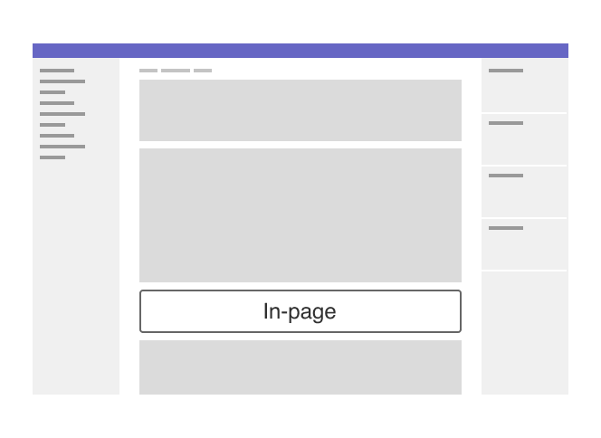
- Similar to alert placement, the content within the banner will determine its placement on the page.
- Generally speaking, an introduction banner should be used at the page-level and relate to all content on the page, whereas a promotion banner can either be used at the page-level or in-page level. If in-page level is used, the banner should be placed directly above the content it relates to.

Accessibility
- When an illustration is used, it should be hidden from screen readers with
aria-hidden="true".
Last updated at: